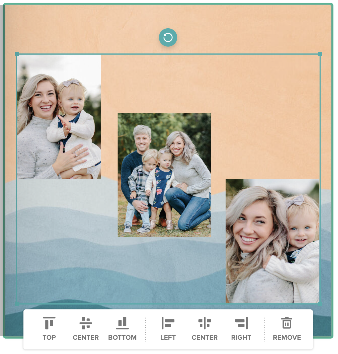
Have you ever wished you could align images in your Mixbook perfectly, without having to zoom all the way into the editor? Are you sick of holding your hand steady trying to nudge the photo a little to the left, and the sticker a little to the right, desperately hoping that when the book goes to print, it will all line up perfectly? Believe us, we know how tedious this process can be, and it usually ends up in complete frustration! Worry no more! We have a layout design tip that will prevent all the eye strain! Our alignment tool allows you to align images in six different ways: top, middle, or bottom, in addition to left, center, and right!
First, let’s try vertical alignment. Vertical alignment allows you to align images vertically, so that they align to the top, center, or bottom of the page. Let’s take a look at the following page:
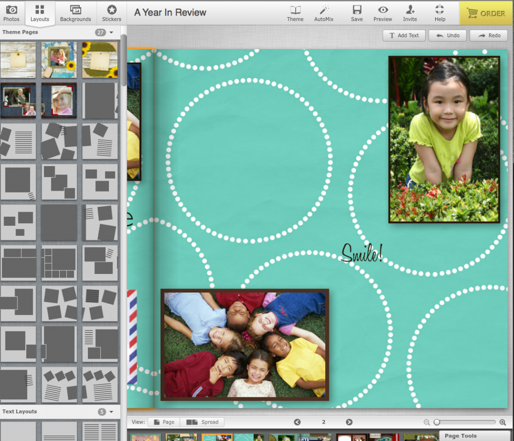
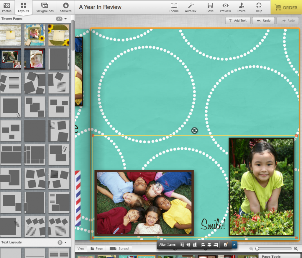
On this page, we have two photos and a text box. Vertical alignment will align all the selected elements with the top or bottom photo, or have them meet in the center. First, click on each element while holding down the shift key. A yellow line will now border your selected elements and the alignment tool bar should appear:
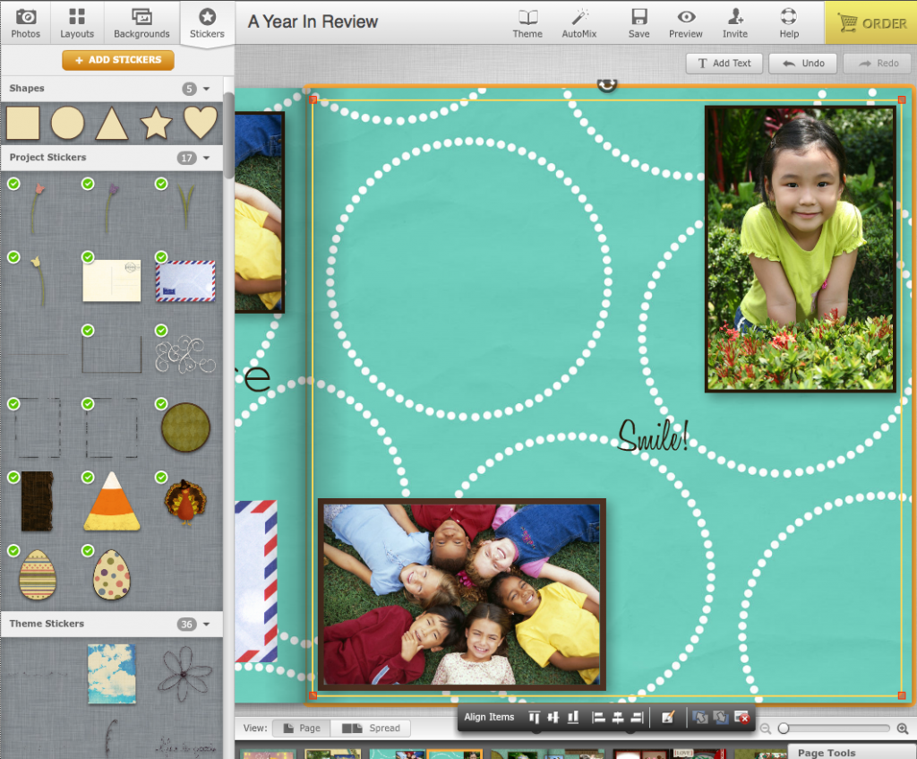
Here is a closer look at the alignment toolbar, with the first three buttons cirlced:

We will use the first three buttons for vertical alignment. The first button will align images to the top, the second to the middle, and the third to the bottom. Keep in mind, your elements will simply shift up or down depending on which button you choose. It will also align with whichever element is furthest to the top or bottom. For middle alignment, the elements will center themselves based on the center of the box the shift-clicking has created.
Here is how the elements will look when clicking the respective button.
Top Alignment (Vertical)
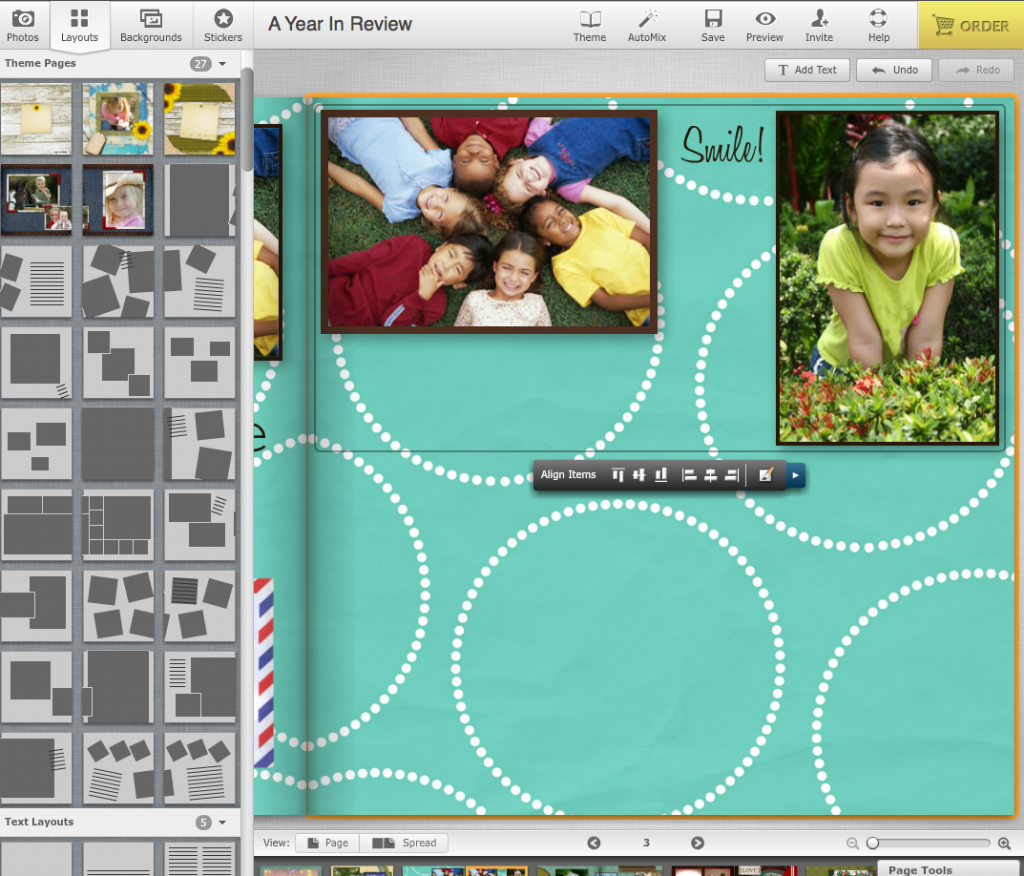
Middle Alignment (Vertical)
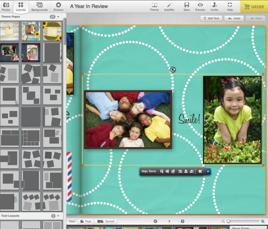
Bottom Alignment (Vertical)
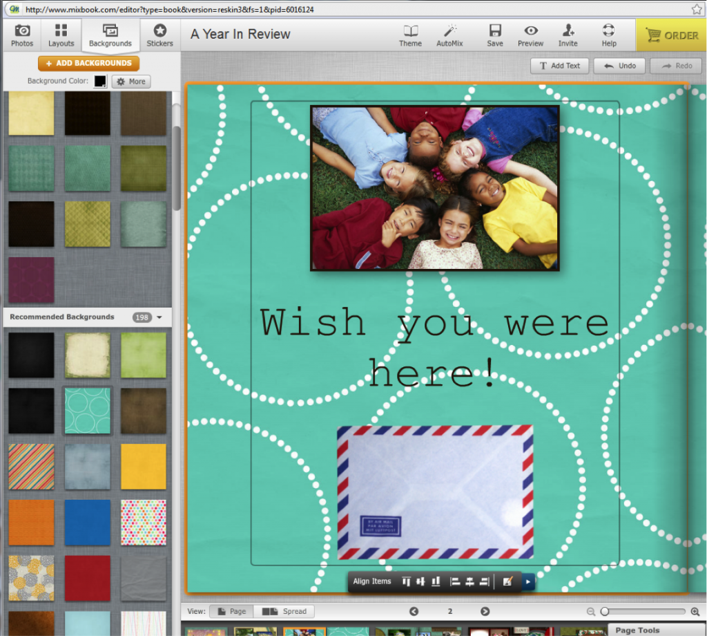
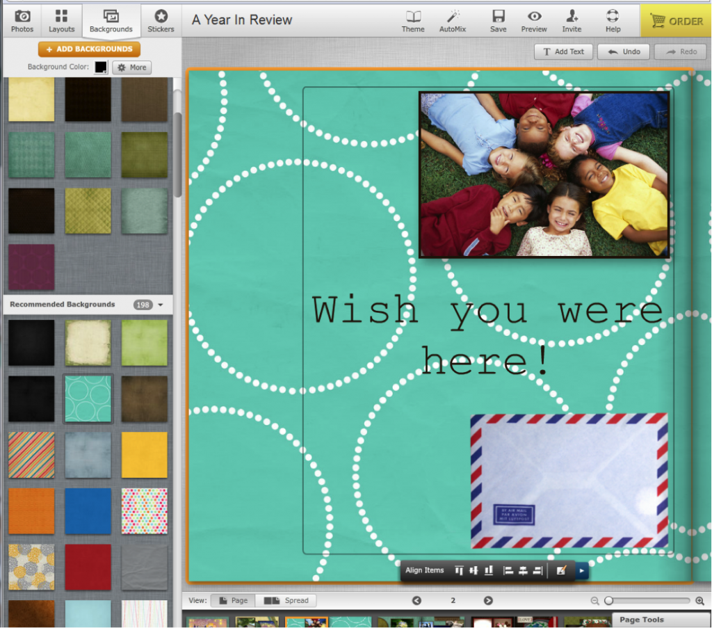
Now let’s try this with horizontalalignment. This will align images to the left, center or right. We will use a different page this time. Space out your elements from bottom to top. In the following screen shot, you will see that we are using a photo, some text, and an envelope sticker. Once you have achieved your desired spacing, shift-click on all the elements. This will bring up the alignment toolbar and border your elements with the yellow line once more. This time, we will be using the last three buttons.
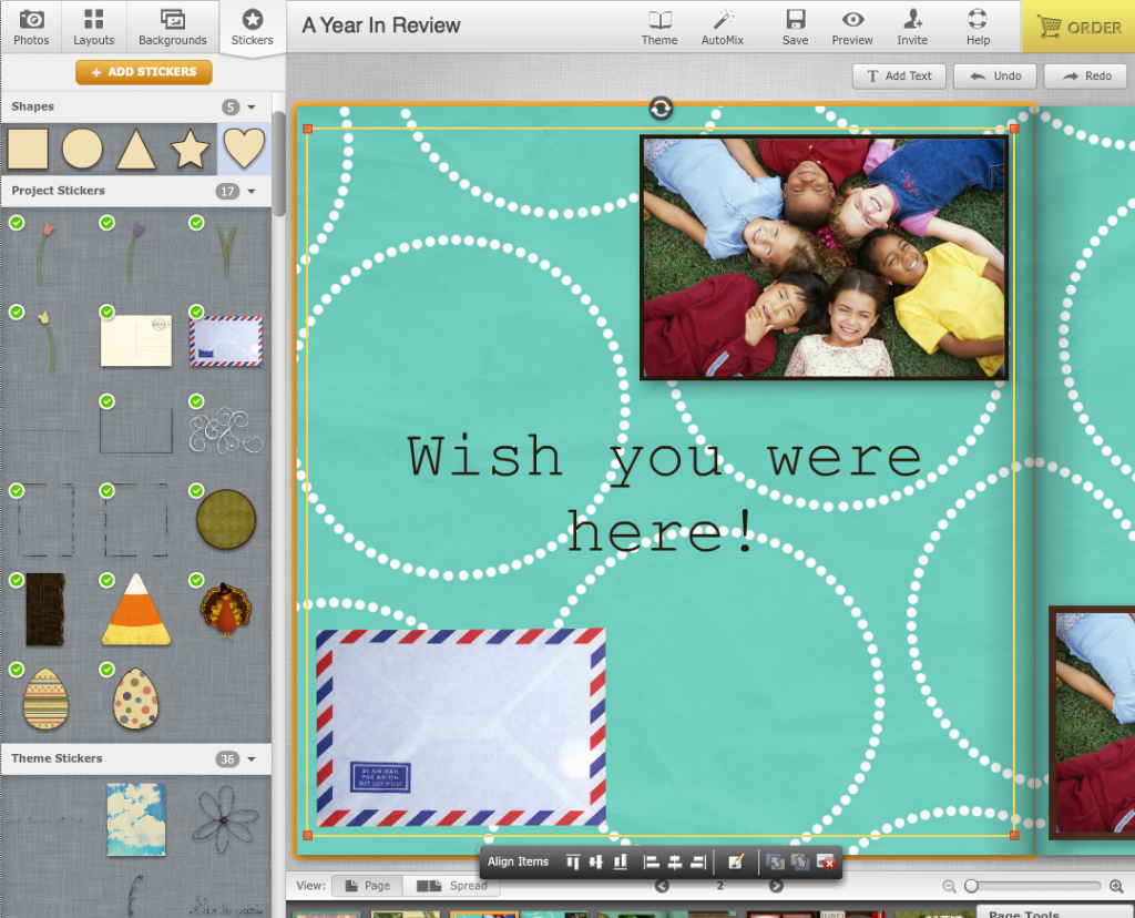
Here is a closer look at the toolbar once more.

The fourth button will align images to the left, the fifth aligns them to the center, and the last button aligns them to the right hand side. Again, your elements will slide to the left or right depending on which button you choose - aligning with whichever element is furthest to the right or left. For center alignment, the elements will center themselves based on the center of the box shift-clicking has created.
The next few photos will show the different types of horizontal alignment.
Left Alignment (Horizontal)
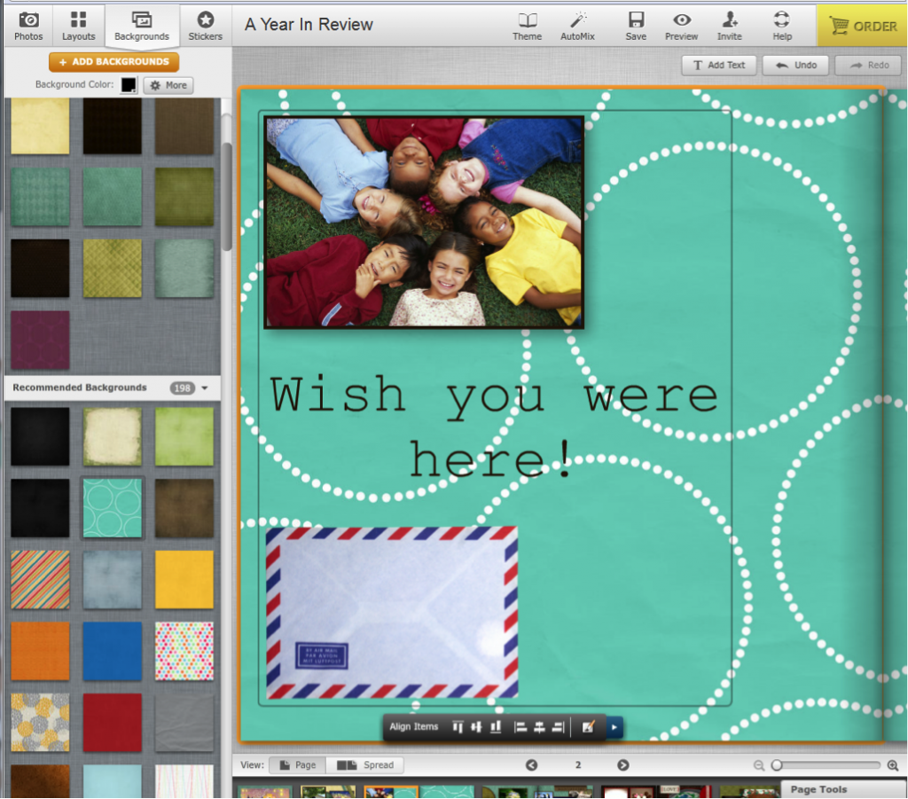
Center Alignment (Horizontal)
Right Alignment (Horizontal)
We hope this layout design tip helps! Start lining up the elements in your project now!
Wondering what to do with all the time you’ve saved, now that you no longer have to align images manually? Why not watch a fun tutorial video showing how to upload photos from Facebook to your Mixbook?

