We recently wrote a tutorial on how to add page numbers to your Mixbook projects. This tutorial will go an extra step further by showing you how to create your own custom table of contents. A table of contents allows you to access specific pages quickly! They give you a point of reference, making it easier to navigate through lengthier books. The Basic Table of Contents

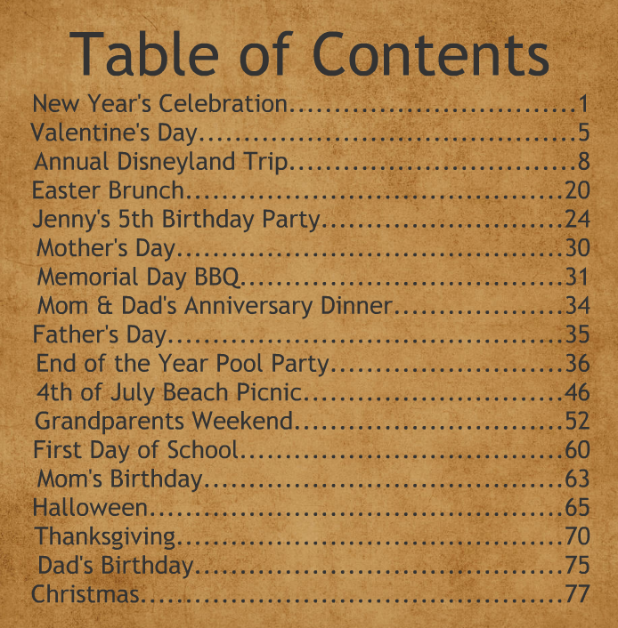
This style of table of contents is the easiest to create. To start, add a text box to page one of your project and type out your title: Table of Contents. Next, choose your font and text size. Remember, this is your title, so you will want to select a slightly larger font size. In this example, our title is size 56. Once you’ve finished, use the Smart Guides to center your title.
Now it’s time to enter our actual content. Add another text box and type in the title of the page (“New Year’s Celebration” for example) and its corresponding page number. Don’t forget to make the text size smaller than your title (we've used text size 23 here)! Next, use your arrow key to move the cursor between your title and page number. Hit the period key so that periods span the page. Once the page number goes onto the next line, you know you’ve got one too many periods.
Continue typing your titles and page numbers until you have labeled all the pages. Your last step is to change the alignment of the “Content” text. We, personally, like to use right alignment – allowing your page numbers to be perfectly aligned to the right.
The Sticker Table of Contents

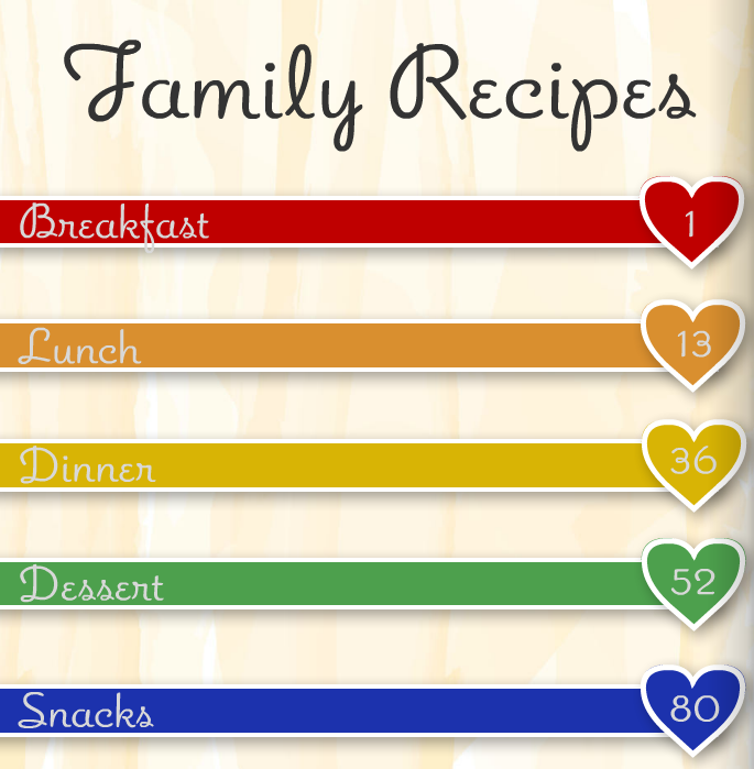
This style of table of contents elevates the basic one discussed above. Instead of periods, we have inserted rectangular-shaped stickers to connect your title to its respective page. The page numbers are housed in heart-shaped stickers, which we have copied and pasted to ensure that the shape sizes stay consistent.
The Photo Shape Table of Contents

The above layout uses actual photos from the book to display your contents. With the use of the photo shapes styles tool and some rectangular stickers, we were able to create a more visual table of contents.
The Two-Page Spread Table of Contents

All our previous examples have used normal Mixbook backgrounds, but don’t forget that using a photo as a background works well too. In this case, we have even spread the photo across two pages to make an even more interesting table of contents layout.
Remember, we are only showing you examples and giving you the tools to get started! We encourage you to experiment with your projects and truly make them yours.

