With the launch of our new kid themes, we’ve channeled our inner child and decided that it was time to become the curious, inquisitive kids we had once been. We were getting tired of taking the same type of photos over and over, so we thought, “Why not try telling your story from a different perspective?” For the most part all our photos are taken from our eye level. We tend to tell the story from our point of view because that’s what comes naturally. Today, however, we’re thinking outside the box. If you ever watch children play, they are all over the place. Climbing up high, crawling down low, and everything in between! So that is exactly what we are going to do.
For this photo project, we’re going to pretend to be 5 years old once more, channeling the days when we were in awe of everything. Besides being fun, these photos can actually better convey the story or feeling you are trying to capture in your Mixbook.
Check out the following photos and see how changes in levels and angles affect the story.
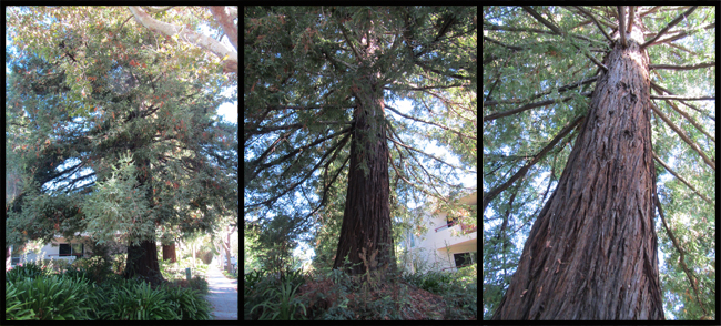
The three photos above are of the same tree, but by moving closer and doing a little stooping, each photo captures a different feeling. The photo on the left is how most people would photograph a tree. However, the second and third photo captures the trees height and the beauty of its branches.
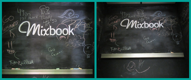
Here is our beautiful elevator with a chalkboard interior (cool isn’t it?). :) While the photo on the left looks great, the photo on the right allows you to see some depth in the elevator. It goes from being a flat photo, to an actual photo of the elevator’s interior.
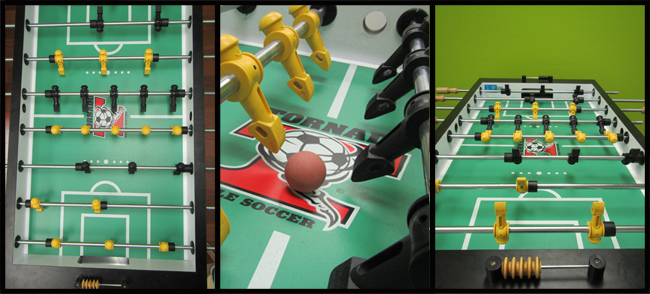
This last photo is our favorite. Each photo can be used for a different reason. The photo from above can be used as a simple foosball table display, while the second photo shows the actual components. Zooming in allows you to get up close and personal, almost as if you were in the game yourself! Place your opponent on the opposite end of the last photo, and you have a great shot portraying the competitiveness of the sport!
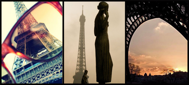
Creating these photos is really easy. Choose a subject and photograph it from the top, bottom, side, diagonally, etc. Chances are, one of those photos will be the perfect fit for your Mixbook page. Thumbpress has a great collection of Eiffel Tower Photos. These photos are taken by various people, but as you can see, each different perspective showcases a different side and beauty of the Eiffel Tower.
If all else fails, give your camera to a little one! If you’re not comfortable with this, have the little one act as the "director", telling you where and how to take the photo. **Insider Tip: Turn this into a fun project with a little one! Make a list of things to photograph and take turns capturing the items on the list. Later, put all the photos side-by-side in a Mixbook to compare perspectives! You may even want to use one of our new kid-friendly themes!
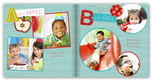
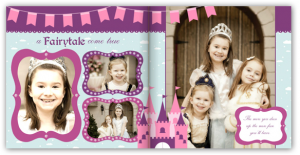
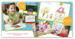
ABC Alphabet ThemePretty Princess ThemeArts and Crafts Theme
By taking the time to step back and see other ways to photograph something, you’ll be able to expand your framing horizons, which of course, result in better photography. We want to know what your favorite “perspective” is! Let us know in the comments below and show us your best shot! :)


