If the travel bug has bitten you, then this post is definitely for you. We’re sure you’ve taken tons of photos, saved a bunch of souvenirs, and are ready to show the world. But sometimes you’re just not sure what the best method is. There’s that framed collage that you can put on the wall, but there’s only so much space before the frame gets a bit too big. There’s the possibility of compiling a movie to encompass videos and slideshows, but that’s not as easily accessible to all your friends and family. There is also the traditional scrapbooking route, but at times, things can get a bit messy, and the book can get a bit bulky as well. So what’s the best compromise? How about a Mixbook! Our page maximum goes all the way up to 399 pages, so if you're up for it, you can get a great-looking book to lay out on your coffee table (easily accessible!), and you can tell the story of your trip! We’ve recently released some magazine type photo book themes, including a Travel Magazine photo book! Here are some quick tips to maximize the this theme.
Tip #1: Customize Your Text Most of the text found in this photo book theme can be edited. The Australian text contained throughout the book is simply a placeholder, giving you a preview of what your project can look like!
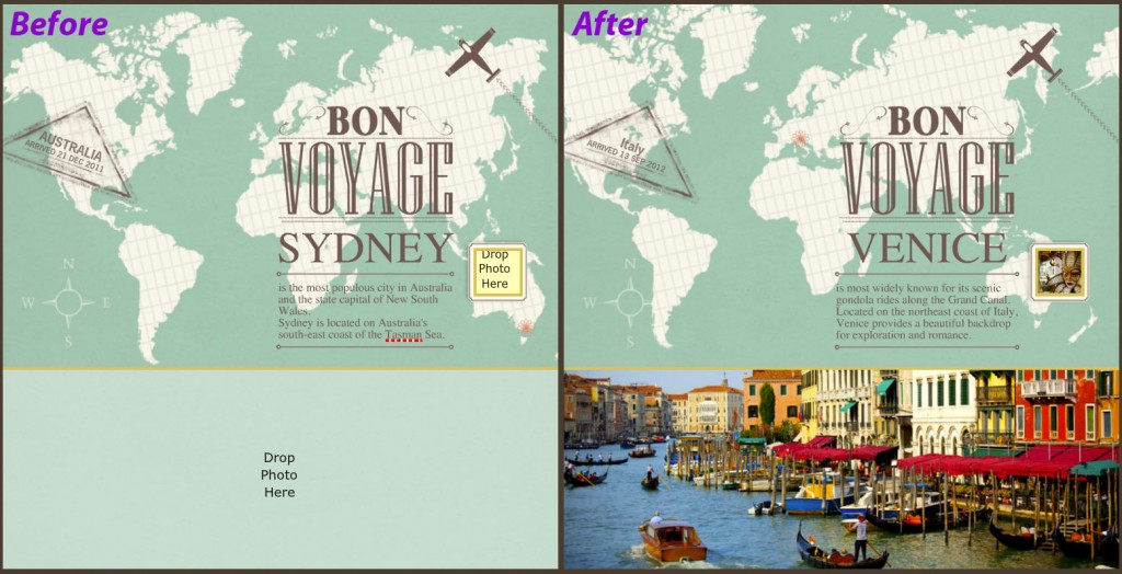
Page one of this photo book theme is a great example of the text customizability options. The cute triangle stamp sticker is actually completely customizable. You can click on the word “Australia” and change it to the country or city you visited, as well as edit the arrival date. All the text located under the Bon Voyage sticker can also be edited so that it directly relates to your trip.
When in doubt, we say click. If it’s text that can be edited, you’ll be able to highlight, delete, and type away. Alternately, if the text is actually a sticker, you’ll see red squares at the corners of the sticker.
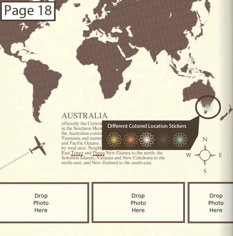
Tip #2: Move the Location Sticker Pages one and 18 both have a “location sticker” placed on the map. Don't forget to move the sticker accordingly! (Reference an atlas, globe, or Google maps to make sure your sticker is in the right place!) You can access differently colored location stickers in the Theme Stickers section of your Sticker tray.
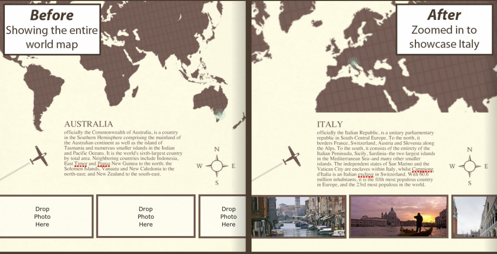
Tip #3: Utilize Maps! Try enlarging the map sticker Mixbook provides, zooming in on the specific country you visited. You can test this out on page 18 of the Travel Magazine photo book theme. Because you already have the entire map on page one, why not change it up and try zooming in on this page?
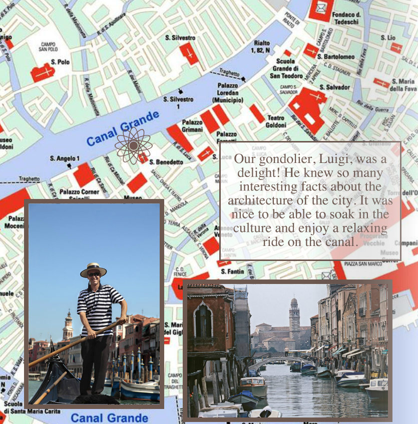
Using street maps of the exact city you visited is another great way to add some flair to your project. First, scan a map of the city you visited, then upload it as a background. You can also upload it as a photo and use the Photo Background Fill button. Next, apply the background to a page and proceed to place the accompanying photos. Here’s one example (of the countless possibilities) of how to lay out your photos on a city map:
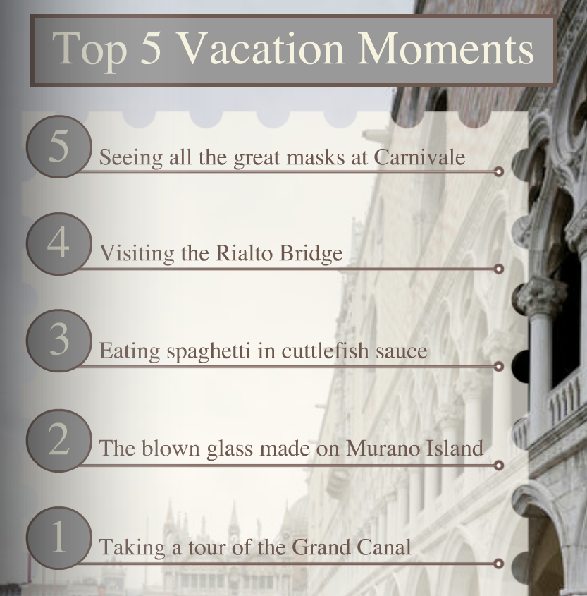
Tip #4: Don’t Be Afraid to Journal! Dedicate a page to journaling. You can write an entry about the trip highlights, most memorable moment of your vacation, or most delicious meal. You can even make a list of all your favorite things from the trip!
**Insider Tip: For the best print result from a scanned image, make sure your scanner is set to scan at 300 DPI!
Hopefully we’ve got your ideas flowing and you’re more than ready to attack this travel project! While we may not be able to travel with you on all your exciting vacations, we look forward to experiencing them with you through your Mixbook! Which trip will you be documenting?

