There is perhaps nothing more personal than the coming together of two completely unique people in marriage—so it makes sense that a wedding invitation would reflect that with personality and personalization. Let your spirit shine through with a wedding invite that breaks free from rigid templates and prescriptions for traditional formatting by creating a Mixbook invitation you both feel proud to send. Attend to every detail by choosing the exact palette, typeface, design elements, and layout you want. Start with a template and customize it to your heart’s content. Or begin with a clean slate and build the exact design you want with the ultimate flexibility and access to every single one of thousands of options for making your invitation exactly the way you want it.
Here are a three of my favorite Mixbook templates and how I chose to make them reflect my style. For each one, all it took was a few easy tweaks with the intuitive Mixbook editor. My husband and I are coming up on our tenth wedding anniversary this August—perhaps we’ll renew our vows and choose one of these designs this time around! I wish Mixbook had been around in 2002!
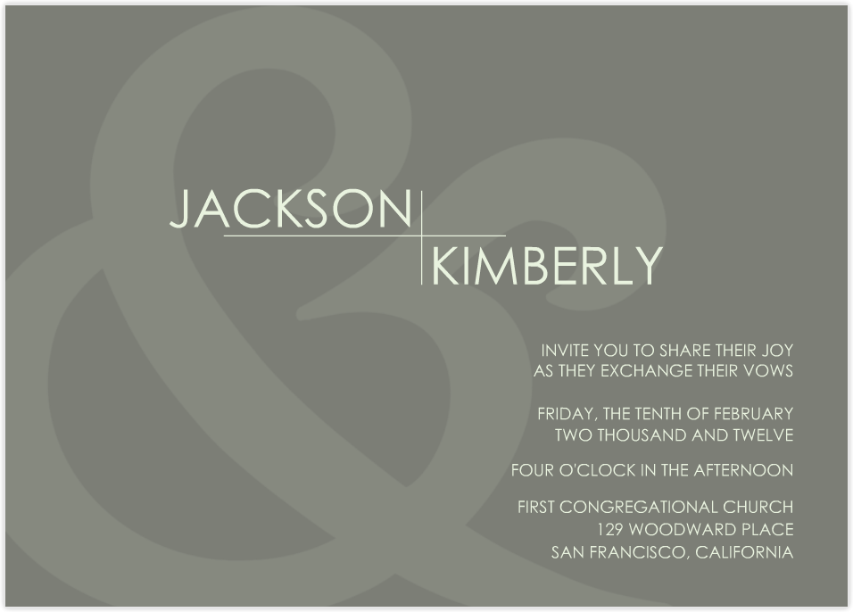
1. Transparent Ampersand
How I Customized It:
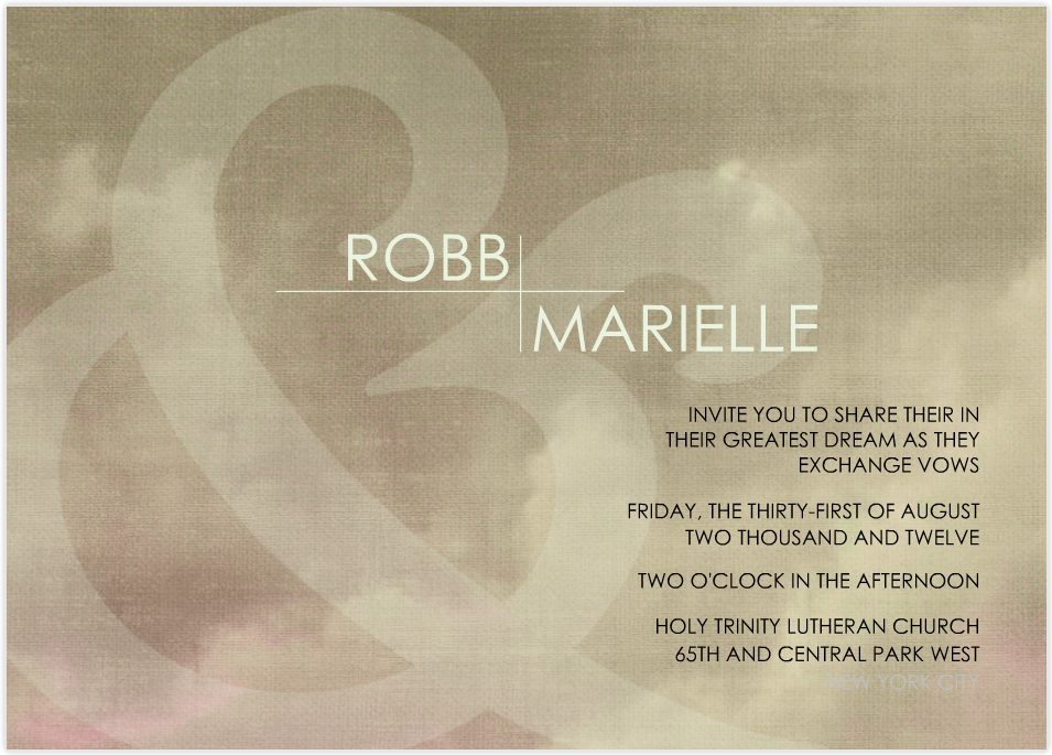
I love the clean typography of the “transparent ampersand” template, but I wanted the background to have some texture and warmth. Using a background of clouds lent a dreamy quality to graphics that seems right for a wedding invitation that captures the spirit of two people coming together to fulfill one another’s dreams.
The clean simplicity of the black and white text adds a nice foil to the moody clouds. To make the original Mixbook template work for my vision, I started by changing the background to the clouds. But since the ampersand was then too faint to see, I changed the opacity with the transparency style tool. I then adjusted the percentage until the ampersand showed through without dominating the design. To play into the dreamy feel of the clouds in the background, I changed the text from “share in their joy” to “share in their greatest dream.” Three simple changes and I’ve created a completely customized wedding invitation!
2. Winter Trees
How I Customized It:
I love the cool graphic look of the “winter trees” template, but since I’m customizing for an August wedding, I needed to downplay the wintry feel. I started by deleting the snowflake sticker from the back and changing the text to mention that our ceremony will be taking place beneath the trees. On the front of the invitation, I deleted our names and instead chose to emphasize the special location—the woods!—which is so important to us. My final design feels crisp and clean but still natural. I’m especially fond of how the outdoor theme comes through without feeling homespun—it’s a look that both my husband and I feel great about.
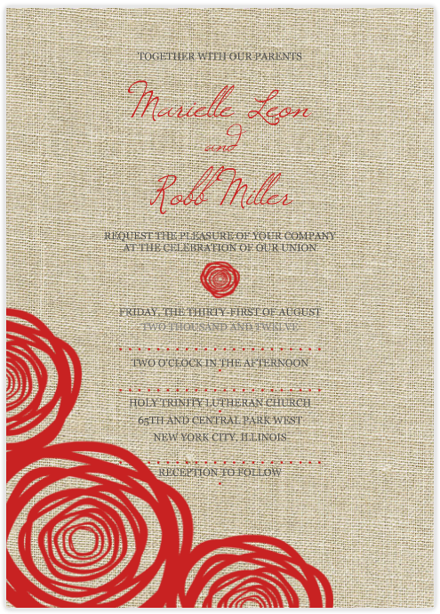
3. Rose Buds
How I Customized It:
The bold stylized botanicals on the “rose buds” template really appealed to me, but I didn’t want the background to be such a stark white, so I chose a textural linen background to minimize the contrast. I love the result, which feels modern but still warm and natural. Because the text is a little harder to read on a textural ground, I increased the type size of our names, and chose a darker gray for the details. I also highlighted the dotted lines setting off the informational text and increased the size a bit. Once I found the right size on one row of dots, I just copied and pasted that type size into the dialog box to make sure it was consistent. Easy as can be!
Since it’s so simple to choose a Mixbook wedding invitation and then customize it, I highly recommend choosing three or four—or more—templates and seeing where your design takes you. You and your spouse-to-be can tinker away together or separately, then narrow down the options and refine those until one clear winner reveals itself.
Which template would you start with for a wedding invitation? What kinds of changes would you make?


