See Mixbook's New Collection of Beautiful Photo Wedding Invitations
There’s something to be said for traditional wedding invitations. Unless, of course, you feel anything but traditional as a couple. Formal, conventional layouts can be absolutely gorgeous – and the couples who choose them may very well have wonderfully solid, lovely relationships. But there are those of us who feel that it’s more interesting to explore the beauty of a lifelong coming-together outside the confines of tradition. Every one of us who falls in love, after all, finds something that’s never happened before – the unique amalgamation of your two quirky personalities and passions. If that’s what you want to celebrate on your wedding day, then a slightly less-formal, more experimental photo wedding invitation format might be right for you.
The latest photo wedding invitations from Mixbook capture the energy of your partnership. They also play with perspectives, celebrate shared interests, and expose exactly what makes you unique as a couple. It’s almost like this type of new wedding invitation gives invited guests a little glimpse of why you came together. And just like you and your soon-to-be-spouse know that it’s just meant to be, everyone on your invite list will have a little window into just why that is too.
Here’s how to choose a photographic wedding invitation that captures the essence of you as a couple.
Choose a series of photographs that represents what you love to do together.
Vintage BannerWe think this invitation works beautifully to set the tone for a wedding in a vineyard. Use one photo that’s close-up in the between the vines and another strolling amidst the dappled light.
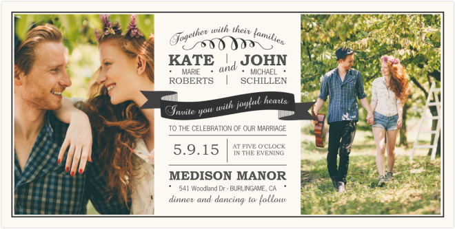
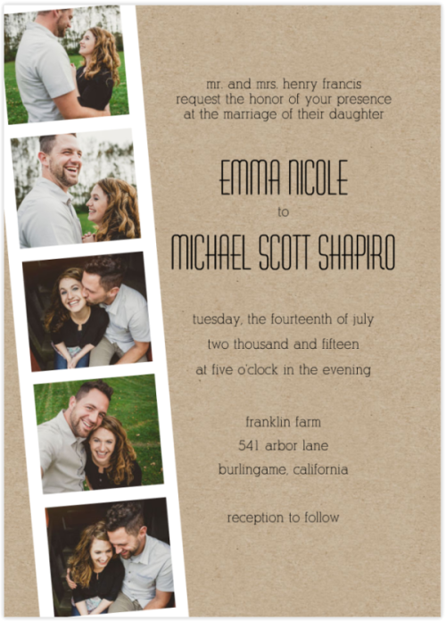
Photo Strip If you have a single series of photos taken in the same background and lighting, show them off in full color! And if you are looking for a way to unify a disparate group of photos over the course of time, convert them to black and white.
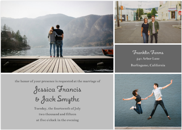
Grey Tones We love the moody feel of the muted palette on this wedding invitation. If your photos don’t naturally play into the same family of colors, tinker with filters till you find an overall look that feels right.
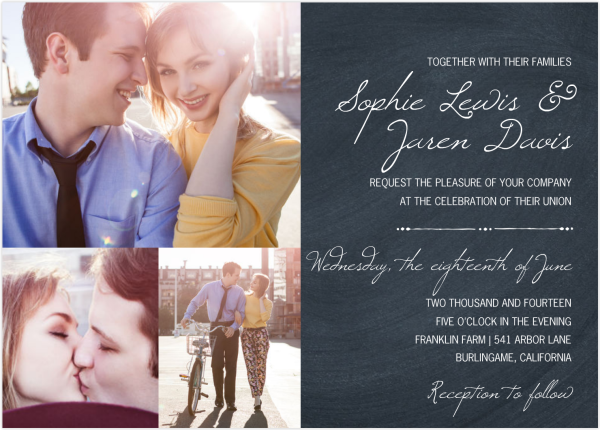
Collage on Chalkboard The homespun feel of chalk on a slate backdrop is so of-the-moment. And we love how vibrantly happy shots taken in bright sunlight are the perfect juxtaposition to the matte text field.
Select one beautiful photograph in an unconventional layout that feels right.
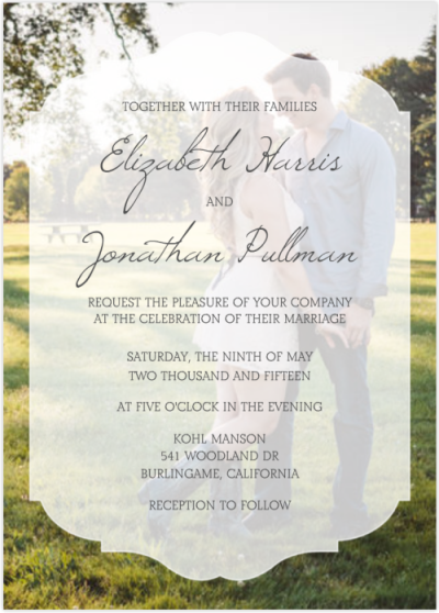
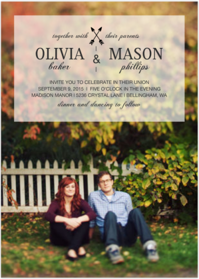
Plaque Overlay The translucent placard scrim over your couple portrait leaves the invited guest wanting more – as it should! It’s a glimpse of all the love and laughter that’s destined to be shared with friends and family on your wedding day.
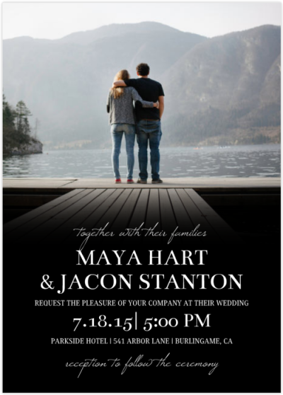
Classic Photo Gradient We love the way a photo with a dark foreground merges with the black text box at the bottom of this wedding invitation. The composition conveys a mood that’s full of hope and lightness for the future.
Transparent Overlay Simple and clean, this parchment scrim conjures the most minimalist and authentic partnership. We love the way a casual photo of the bride-and-groom to be sitting in the grass with fall leaves overhead creates an unencumbered yet striking composition.
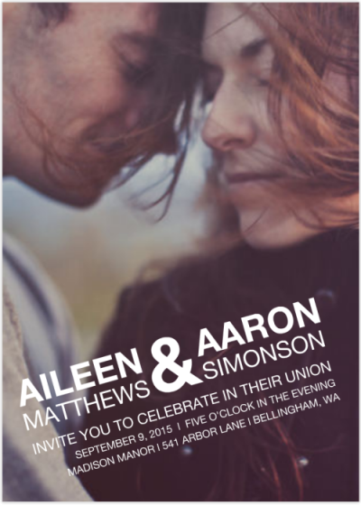
Tilted Type Feature a single photograph from edge to edge with this clean, modern layout. We love the intimacy a close-up captures, with a bold typeface to counter the preciousness of the moment.=
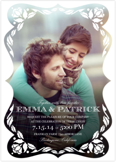
Full Scallop Photo Traditional reinvented to be fully modern. Scaled up and rendered in black and white, the scallopwork edging on this wedding invitation is fun and fresh. It looks beautiful framing a formal photograph – or a fun-loving one like this.
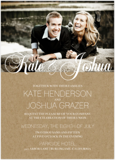
Script Names on Kraft One lighthearted, fun photo that’s horizontally oriented is a great way to top off this Kraft-paper invitation. We love the look of a photo that plays into a neutral palette – with the formal calligraphic script creating a beautiful counterpoint to the natural, laid-back look of the invitation.
Happy Mixbooking! Happy Wedding Planning!

